Dashboard
The Dashboard is your high-level business snapshot. It opens with a welcome message, a fiscal-period date range picker, a row of performance cards, and a comparison chart that helps you spot trends quickly without digging through individual modules.
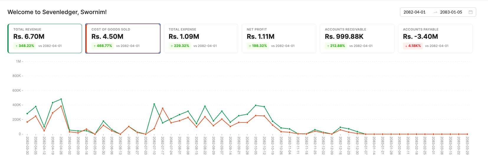
Dashboard view showing the welcome header, date range selector, six KPI summary cards, and the performance trend chart.
What You See First
- Welcome header: The page greets the signed-in user by name, such as
Welcome to Sevenledger, Swornim! - Date range picker: The control at the top right drives the period used for the cards and chart. In your example, the dashboard is showing
2082-04-01through2083-01-05. - Summary cards: The top row highlights the most important metrics for the active app and organization.
- Trend chart: The large line chart below compares the currently selected KPI series across the chosen date range.
Dashboard Cards
For the accounting-style dashboard shown in the screenshot, the cards include:
- Total Revenue
- Cost of Goods Sold
- Total Expense
- Net Profit
- Accounts Receivable
- Accounts Payable
Each card shows:
- the metric name,
- the current total value,
- the percentage change,
- and the comparison baseline shown as
vs <start date>.
The cards are also interactive. Clicking a card selects it for the comparison chart below. Selected cards are highlighted with the card’s accent color, which makes it easier to compare multiple KPI lines at once.
How to Read the Chart
The chart under the cards plots the selected dashboard metrics over time.
- Each line matches the color of its selected KPI card.
- The x-axis shows the reporting dates across the selected range.
- The y-axis scales automatically based on the values being compared.
- Hovering the chart helps you compare the values for the same date across the selected metrics.
This makes the dashboard especially useful for answering questions like:
- Is revenue rising faster than cost of goods sold?
- Are expenses flattening out or spiking?
- Are receivables or payables drifting in the wrong direction?
Best Way to Use It
- Start with the cards to identify the metric that needs attention.
- Change the date range when you want to compare a different fiscal period.
- Select one or more KPI cards to focus the chart on the signals you care about.
- Use the dashboard as a decision screen, then move into Sales, Buy, Cashflow, or Financials for the detailed records behind the numbers.